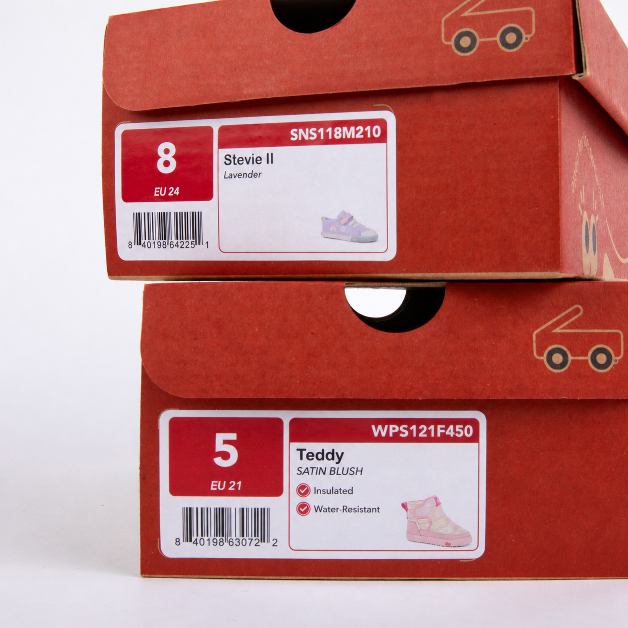
As the Senior Graphic Designer at See Kai Run, I led the redesign of our signature shoebox to meet evolving business needs while strengthening the brand experience. What began as a cost-driven shift in packaging materials became an opportunity to rethink how our shoebox could better communicate what makes See Kai Run shoes different.
The result is a more intentional packaging experience that brings our core features and benefits to the forefront while staying true to the brand’s playful identity.
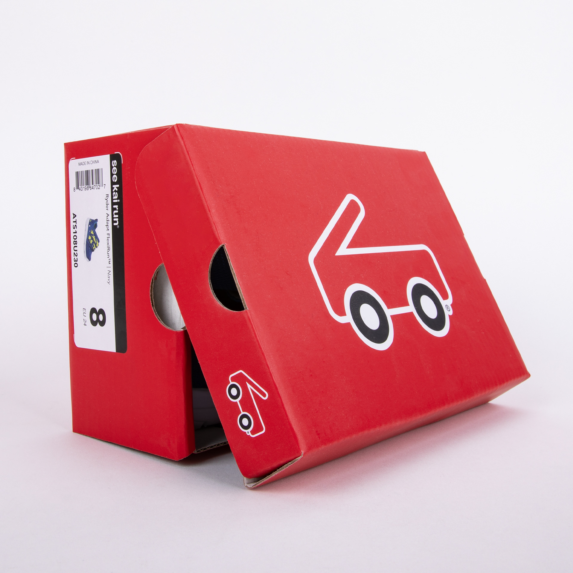
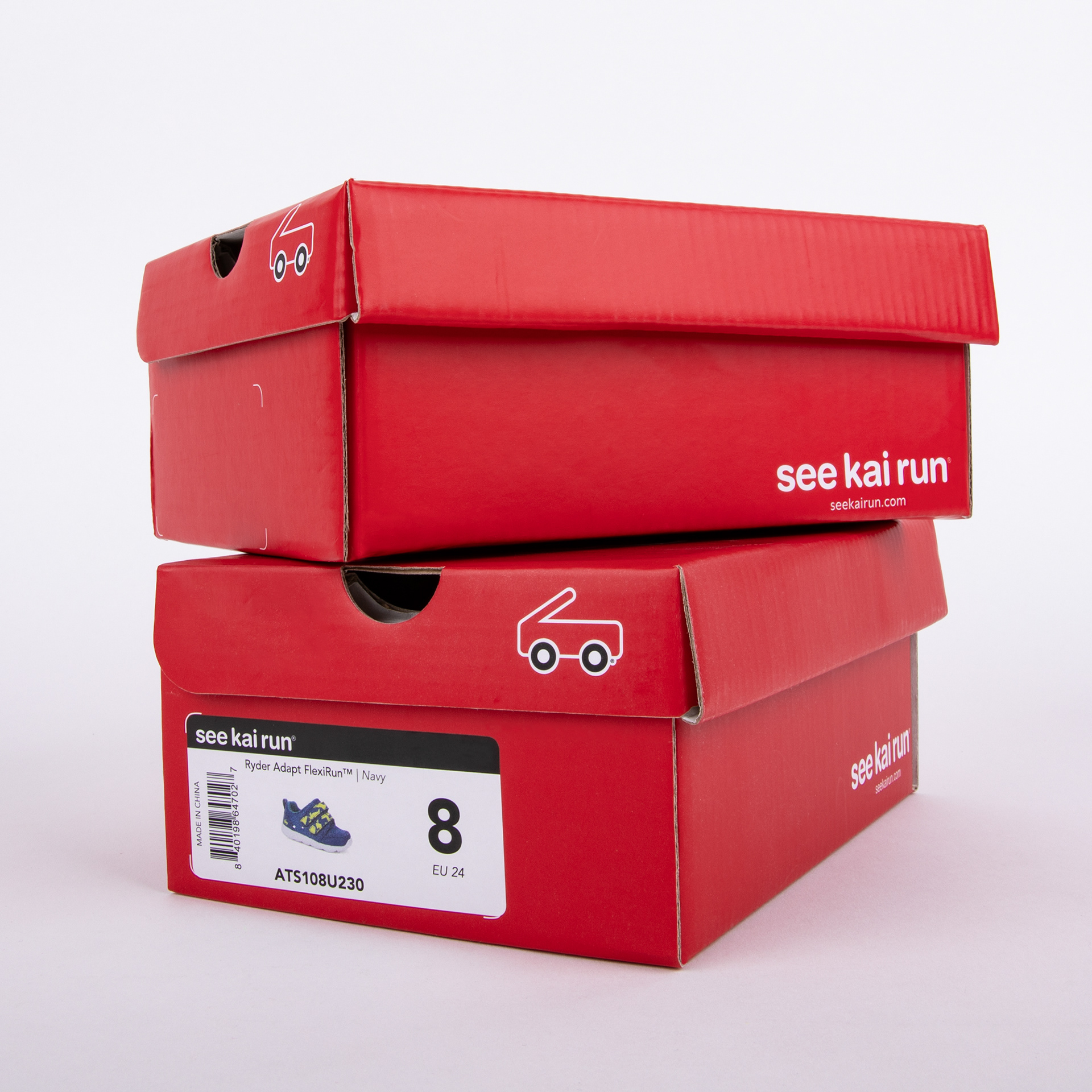
Previous Packaging
See Kai Run’s signature red shoebox has long been a recognizable part of the brand. When rising production costs created a need for a more cost-effective packaging solution, the decision was made to transition to Kraft, creating an opportunity to rethink the box beyond simply changing its material.
Design Approach & Final Design
I approached the redesign with the goal of making every surface of the box feel purposeful. From product information placement to playful details, I considered each element to create a cohesive design that balances brand personality with practical functionality.
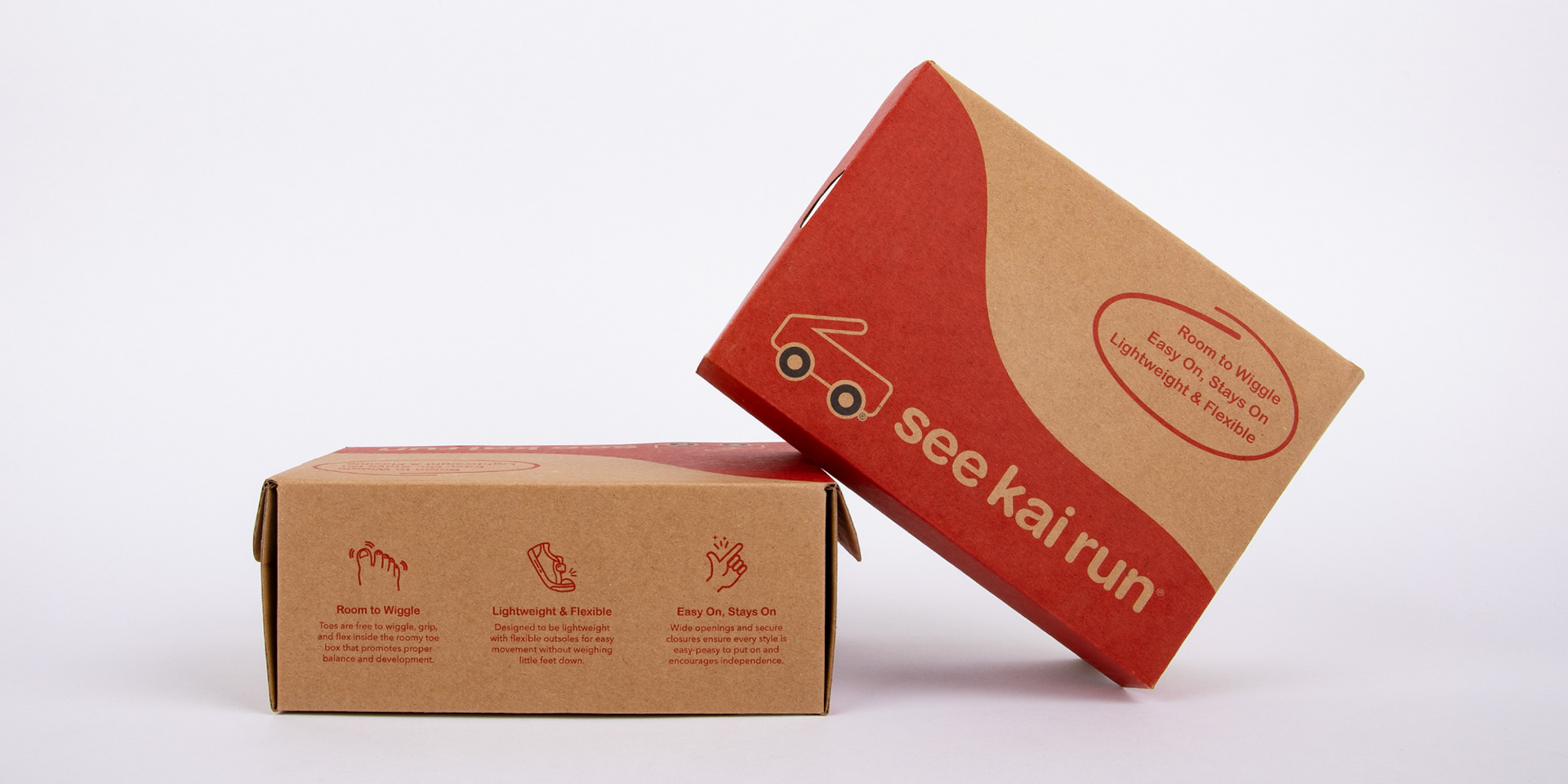
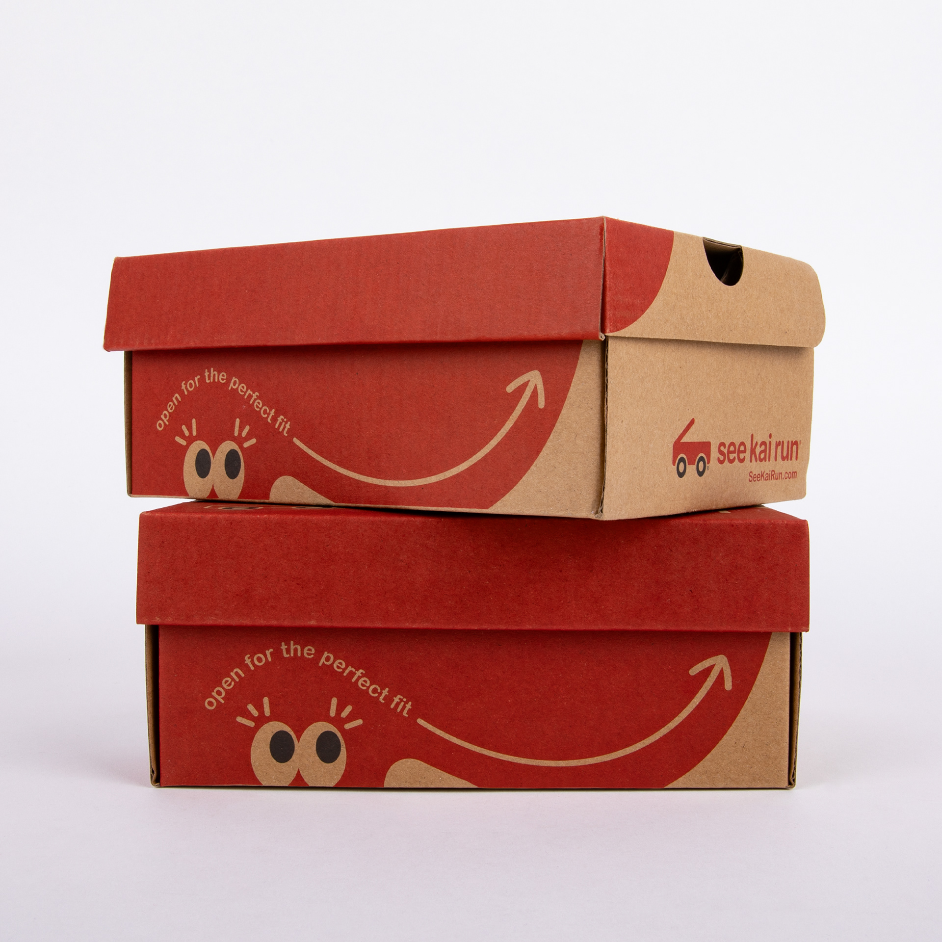
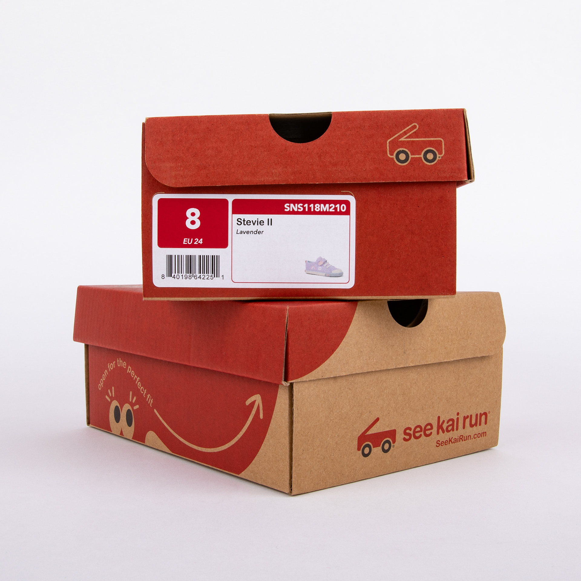
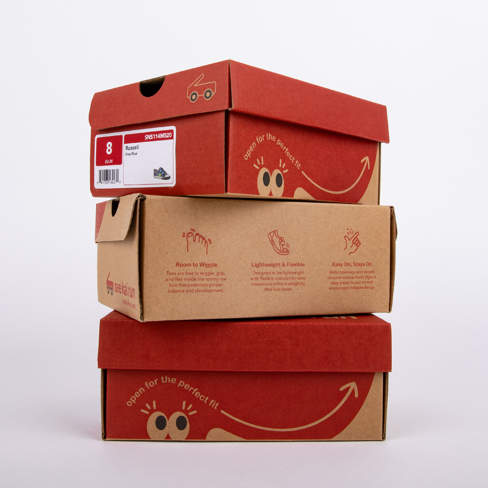
Every surface of the box was designed with intention. Core features and benefits are highlighted through custom icons and supporting descriptions, while playful details like the eyes and “Open for the Perfect Fit” arrow bring personality to the packaging. A “Check Your Size” QR code on the bottom connects parents to an online sizing guide, adding another layer of functionality.
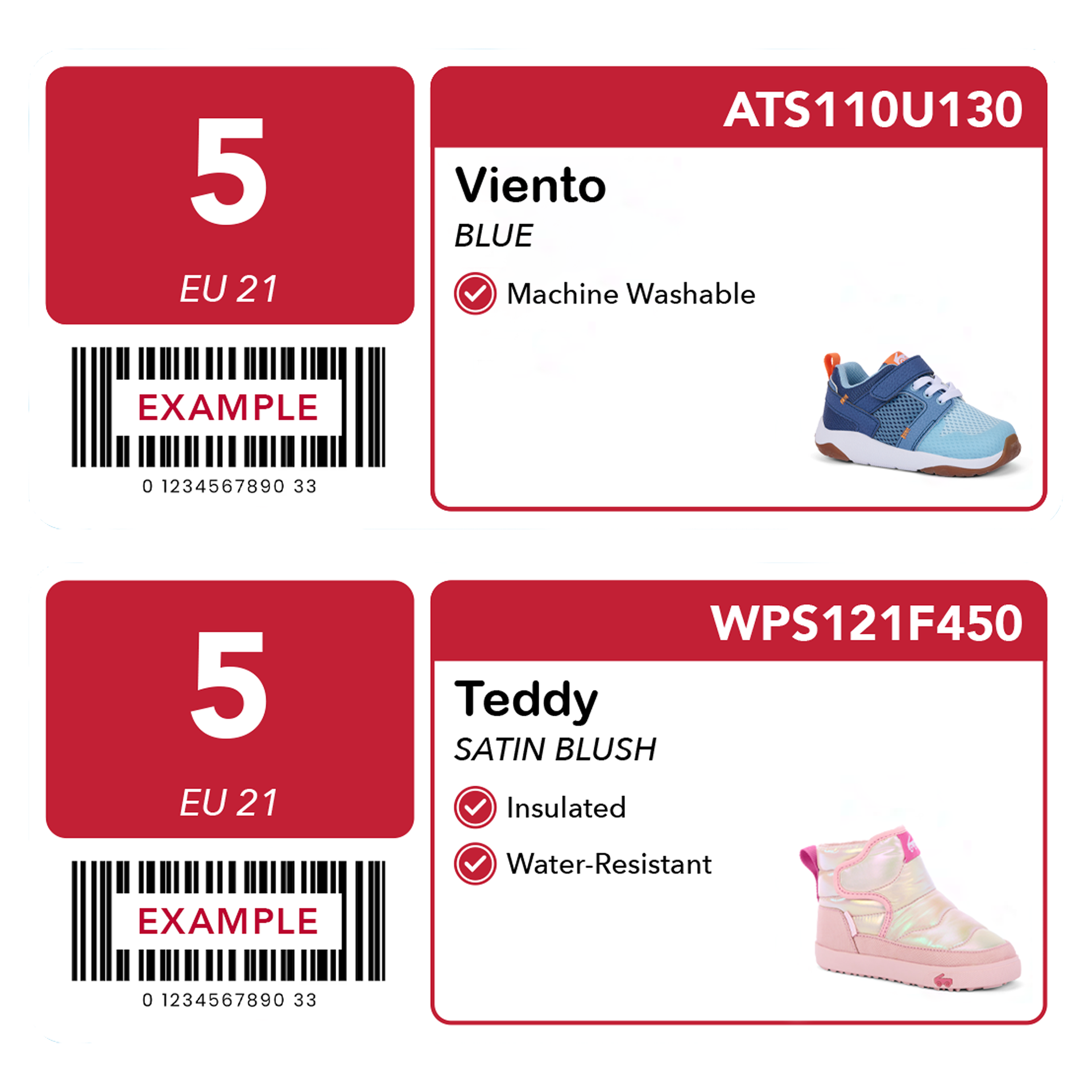
Shoebox Label
I also redesigned the shoebox label to make key product attributes easier to identify at a glance. A new checkmark system highlights relevant features, creating a more informative label.